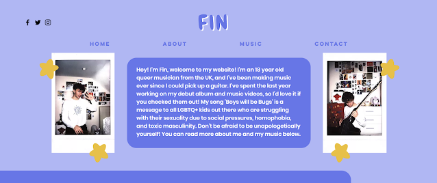
This is the updated version of the second page of my website. I've added text to the top box, and to the 'Fin's story' box, and I've changed the tweets into a slideshow rather than just a bunch of screenshots. Next to the tweets, I've added the two posters that featured in the background of my music video (digital convergence), and the 'Scott Pilgrim vs the World' poster can be clicked on, which takes you to a YouTube clip of the scene that my video makes an intertextual reference to, giving my audience members a sense of gratification even if they didn't originally understand the reference. Under the bloopers video there is a picture of my artist and the text gif that features in the video as well (more digital convergence), which links to the exclusive poster Easter egg when you click on it.


No comments:
Post a Comment